Image is Everything
Client: Image Comics
Category: Brand Identity Proposal
Image Comics is an independent comic book and graphic novel publisher that is now the third largest comics publisher in the United States. They continue to push forward the comics medium with a commitment to supporting the independence and creative freedom of comics artists. Image provides resources for creators to publish their work and maintain complete ownership and control over their creations.
Challenge
Develop a compelling new identity system that also reflects Image’s legacy as a groundbreaking comics publisher.
Themes
Independent spirit, creative freedom, diverse artistic visions, diverse genres, pop culture leader, boundary-pushing, print media.
Identity
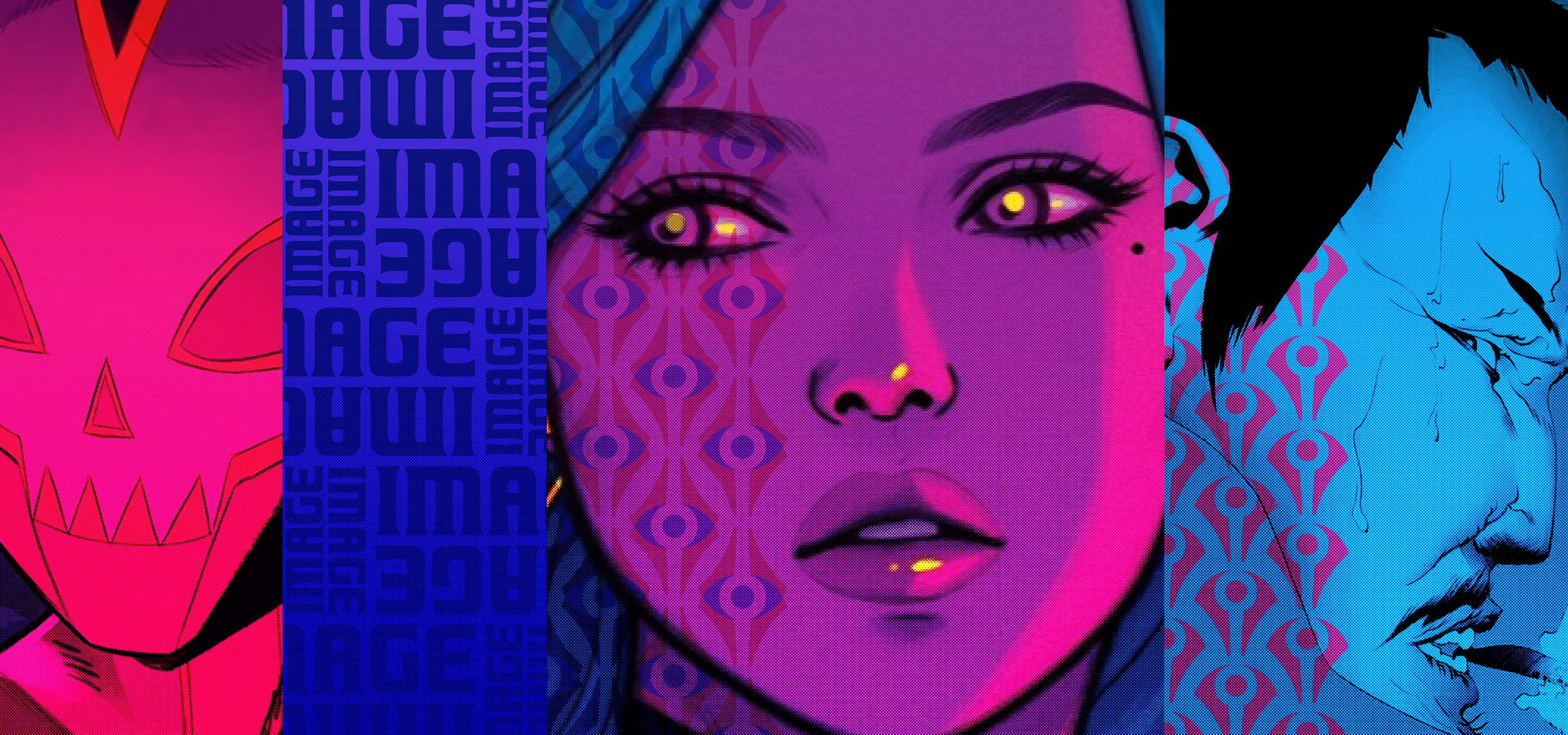
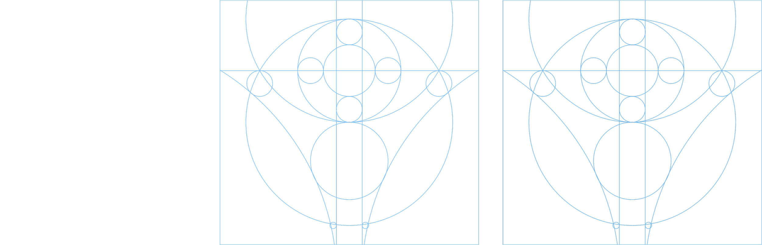
The visual language of the brand is bold, colorful, and energetic. The new symbol is inspired by the shape of a fountain pen nib, one of the primary tools of a comics artist. The updated logotype references the type of the original logo. On closer inspection, there is a pencil hidden in the letter “A”. The mark is immediately iconic and distinct creating a heroic emblem that stands for independence and creativity.
Logo animation
Color palette
The core color palette is inspired by the inks used in four-color printing: cyan, magenta, yellow, and black. Here, the black is replaced by a vibrant pair of violet colors that serve as the lead color combo.
Photo effect
As a nod to the print quality of vintage comic books, a halftone effect is applied to people photography. This combined with a duotone effect using the core colors maintains a consistent look to portraits and other photos.
Patterns
A variety of branded patterns can be applied to promotional collateral and premium items.
Branding
The visual language of the brand is bold, colorful, and energetic. The new symbol is inspired by the shape of a fountain pen nib, one of the primary tools of a comics artist. The updated logotype references the type of the original logo. On closer inspection, there is a pencil hidden in the letter “A”. The mark is immediately iconic and distinct creating a heroic emblem that stands for independence and creativity.

Color palette
The core color palette is inspired by the inks used in four-color printing: cyan, magenta, yellow, and black. Here, the black is replaced by a vibrant pair of violet colors that serve as the lead color combo.
Photo effect
As a nod to the print quality of vintage comic books, a halftone effect is applied to people photography. This combined with a duotone effect using the core colors maintains a consistent look to portraits and other photos.
Patterns
A variety of branded patterns can be applied to promotional collateral and premium items.

Branding
The visual language of the brand is bold, colorful, and energetic. The new symbol is inspired by the shape of a fountain pen nib, one of the primary tools of a comics artist. The updated logotype references the type of the original logo. On closer inspection, there is a pencil hidden in the letter “A”. The mark is immediately iconic and distinct creating a heroic emblem that stands for independence and creativity.
Color palette
The core color palette is inspired by the inks used in four-color printing: cyan, magenta, yellow, and black. Here, the black is replaced by a vibrant pair of violet colors that serve as the lead color combo.
Photo effect
As a nod to the print quality of vintage comic books, a halftone effect is applied to people photography. This combined with a duotone effect using the core colors maintains a consistent look to portraits and other photos.
Patterns
A variety of branded patterns can be applied to promotional collateral and premium items.
Process
Stylescapes
Before starting the design process in earnest, I created these preliminary stylescapes to explore potential directions for the visual brand. These stylescapes collect options for color palettes, typography, and textures as well as logo comps, customer persona portraits, and existing visual assets.
STYLESCAPE 1
STYLESCAPE 2
Logo Design
Current Image Comics logo and its variations
Exploration of new marks
Alternate logo options: I explored several directions for the logo including optical trickery, vintage comics imprints, and modular letterforms.
It all begins with an idea. Maybe you want to launch a business. Maybe you want to turn a hobby into something more. Or maybe you have a creative project to share with the world. Whatever it is, the way you tell your story online can make all the difference. Don’t worry about sounding professional. Sound like you. There are over 1.5 billion websites out there, but your story is what’s going to separate this one from the rest. If you read the words back and don’t hear your own voice in your head, that’s a good sign you still have more work to do.